
Simplifying Light and Dark Mode in .NET MAUI Apps

Granting your .NET MAUI app elements the ability to display in dark or light mode is easier than ever. Learn how!
In the modern era, it’s increasingly common for applications to offer both light and dark mode options for user interfaces. One of the earliest features of .NET MAUI was the ability to implement this in our apps! The conventional way to do this is by adding the AppThemeBinding markup extension inside the property of a control, then defining values for both light and dark modes. This process is repeated for every property requiring it!
But imagine if you didn’t have to repeat the same colors for light and dark mode frequently. What if you could create a style that already assigned colors for both modes? Or even better, what if you could use this in conjunction with existing styles? That’s exactly what we’re going to explore in this article.
Getting a Preview of AppThemeObject and AppThemeColor Markup Extension
In addition to using the AppThemeBinding markup extension for managing light and dark mode appearances, you can utilize other markup extensions like AppThemeObject and AppThemeColor. These extensions assist in creating thematic resources for our applications, simplifying the management of colors, images and other resources. They also automatically adapt based on the application’s current appearance mode.
Both AppThemeObject and AppThemeColor are part of the .NET MAUI Community Toolkit. That’s why, before continuing, let’s understand how to set up the environment to use this toolkit!
.NET MAUI Community Toolkit: Initial Setup
To correctly implement it, ensure that the .NET MAUI Community Toolkit is properly configured in your app. Setting it up is straightforward, as outlined in the steps below:
1. Installation: First, make sure to install the toolkit by adding the Community.Toolkit.Maui NuGet package.

2. Setup in MauiProgram.cs: After adding the NuGet package, navigate to MauiProgram.cs. Right below UseMauiApp<App>(), append:
.UseMauiCommunityToolkit()
3. Namespace Addition: Include the toolkit namespace in your page:
xmlns:toolkit="[http://schemas.microsoft.com/dotnet/2022/maui/toolkit](http://schemas.microsoft.com/dotnet/2022/maui/toolkit)"
Understanding the Properties
The properties of both markup extensions, AppThemeColor and AppThemeObject, are identical. The only difference lies in the type of property. For AppThemeColor, the type is Color, while for AppThemeObject, the type is Object. Let’s see each one of them:
- Dark: The value assigned to the property when the application is in dark mode.
- Light: The value assigned to the property when the application is in light mode.
- Default: The value used for the property when the application is in either light or dark mode, and no specific value has been provided for that theme.
- x:Key: You will also need a Key Identifier. This lets you reference your theme style when applying it to a property. I recommend choosing a name that describes its specific purpose, like
MainTextColor. This name makes it clear that it’s used to set the colors of the main text in the App.
Let’s See the Details
AppThemeObject
AppThemeObject is a generic, theme-friendly target that lets you set any object for Light, Dark and Default properties. Since it’s not strongly typed, the values of each property are evaluated and output at runtime. Thus, if an error occurs, it could potentially cause a runtime exception.
Visual usage structure
First, we will explore a graphical explanation of its usage, followed by a code example.
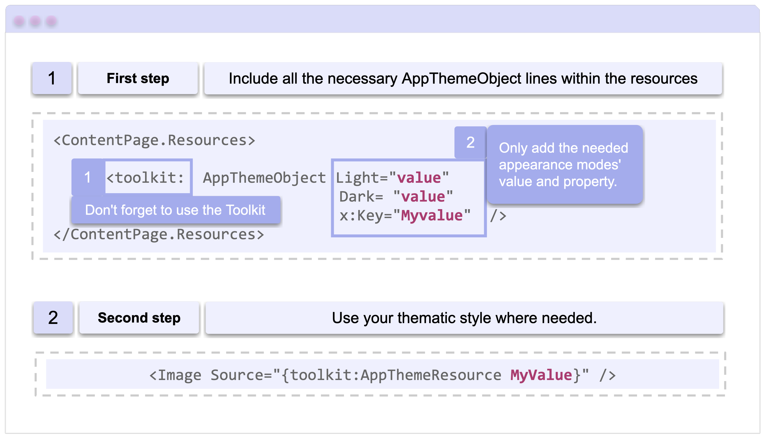
Now, let’s look at a code sample:
<ContentPage xmlns="http://schemas.microsoft.com/dotnet/2021/maui" xmlns:x="http://schemas.microsoft.com/winfx/2009/xaml"
  x:Class="AppThemeSample.MainPage" xmlns:toolkit="http://schemas.microsoft.com/dotnet/2022/maui/toolkit">

  <ContentPage.Resources>
    <toolkit:AppThemeObject Light="dark.png" Dark="light.png" x:Key="MyMainImage" />
  </ContentPage.Resources>

  <VerticalStackLayout>
    <Image Source="{toolkit:AppThemeResource MyMainImage}" />
  </VerticalStackLayout>
</ContentPage>
AppThemeColor
AppThemeColor is a unique theme-aware color that lets you set different colors for the Light, Dark and Default properties.
Visual usage structure
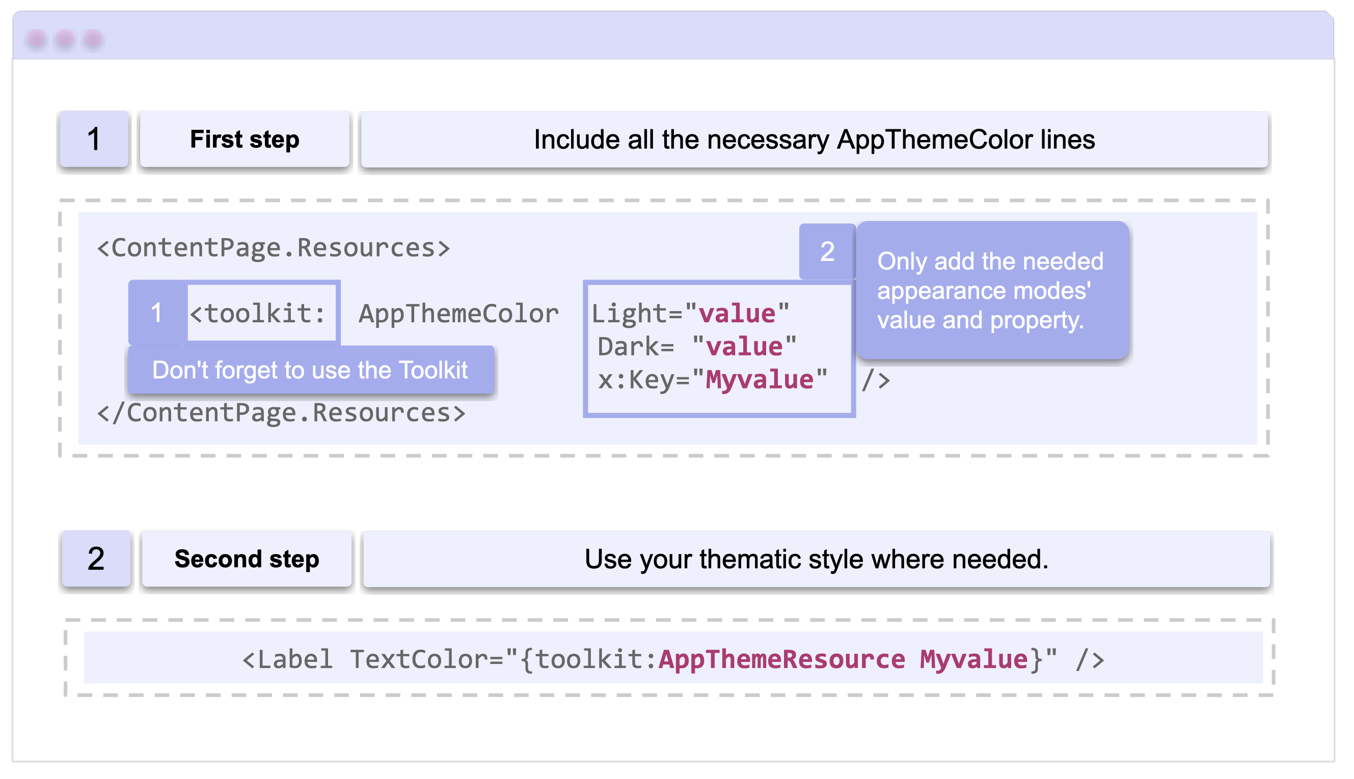
Now, let’s look at a code sample:
<ContentPage xmlns="http://schemas.microsoft.com/dotnet/2021/maui"
  xmlns:x="http://schemas.microsoft.com/winfx/2009/xaml"
  x:Class="AppThemeSample.MainPage"
  xmlns:toolkit="http://schemas.microsoft.com/dotnet/2022/maui/toolkit">

  <ContentPage.Resources>
    <toolkit:AppThemeColor Light="Red" Dark="Green" x:Key="PrimaryTextColor" />
  </ContentPage.Resources>

  <VerticalStackLayout>
    <Label TextColor="{toolkit:AppThemeResource PrimaryTextColor}" />
  </VerticalStackLayout>
</ContentPage>
Using AppThemeColor and AppThemeResource Through Styles
Since theme-aware resources are usable in a ResourceDictionary, they can also be utilized through Styles. Here’s an example of how to do it.
<ContentPage xmlns="http://schemas.microsoft.com/dotnet/2021/maui"
  xmlns:x="http://schemas.microsoft.com/winfx/2009/xaml"
  x:Class="AppThemeSample.MainPage" xmlns:toolkit="http://schemas.microsoft.com/dotnet/2022/maui/toolkit">
  <ContentPage.Resources>
    <toolkit:AppThemeColor Light="Red" Dark="Green" x:Key="PrimaryTextColor" />

    <Style x:Key="Headline" TargetType="Label">
      <Setter Property="FontFamily" Value="Segoe UI" />
      <Setter Property="FontSize" Value="10" />
      <Setter Property="TextColor" Value="{toolkit:AppThemeResource PrimaryTextColor}" />
    </Style>
  </ContentPage.Resources>

  <VerticalStackLayout>
    <Label Style="{StaticResource Headline}" />
  </VerticalStackLayout>
</ContentPage>
💡 Highlight
AppThemeObject and AppThemeColor both derive from the abstract base class AppThemeObject<T>. This structure allows for the creation of more specific, strongly typed resources. Should your project require a unique resource type not provided by the Community Toolkit, you have the flexibility to develop your own derivative class.
⚠️ Important
For additional context, if you’re unfamiliar with the AppThemeBinding extension, we recommend reading the article Handling Light and Dark Mode With .NET MAUI. While it’s not essential for understanding this article, it will provide a more comprehensive picture.
Conclusion
I hope that from now on you know how to adapt your applications for light and dark mode using the new markup extensions you learned!! 💚💕
See you next time! 💁♀️
References
This article was based on the official documentation:
Interested in streamlining your .NET MAUI app’s themes even more? Check out Telerik UI for .NET MAUI controls and the power of Progress ThemeBuilder.

Leomaris Reyes
Leomaris Reyes is a Software Engineer from the Dominican Republic, with more than 5 years of experience. A Xamarin Certified Mobile Developer, she is also the founder of Stemelle, an entity that works with software developers, training and mentoring with a main goal of including women in Tech. Leomaris really loves learning new things! 💚💕 You can follow her: Twitter, LinkedIn , AskXammy and Medium.
Related Posts
Comments
All articles
Topics

Latest Stories
in Your Inbox
Subscribe to be the first to get our expert-written articles and tutorials for developers!
All fields are required