background cover
background cover

Kendo UI for Angular

Roadmap

Coming in 2024

We are pleased to announce our updated product release schedule, aiming to increase the frequency in which we deliver value to you.  Here is the timeline for our upcoming major releases this year:


  • 2024 Q1 Release - Month: February
  • 2024 Q2 Release - Month: May
  • 2024 Q3 Release - Month: August
  • 2024 Q4 Release - Month: November

In addition to the major releases, we will continue to deliver incremental improvements through our 6-week release cadence.


The Kendo UI for Angular Team is excited to announce the roadmap for new components and features on our list for release. Many of these items will be released as part of the Q1 February release and others will come shortly after. 

Your feedback is a huge factor in these plans. After all, our mission is to make your life easier. We encourage you to keep sharing your thoughts, plans, and ideas for what next you would like to see developed in the Angular component library in our dedicated feedback portal.  

The items below are what we feel comfortable announcing, but there is more on our radar. Check back periodically for updates.

Kendo UI for Angular

A11Y Keyboard Navigation Improvements

New feature

Enhance accessibility with improved keyboard navigation. Now, effortlessly scroll through chart elements using your keyboard, making your charts more accessible and user-friendly. 

Support for Standalone Hybrid Angular Components

New feature

Embracing the evolution of Angular architecture, we are going to support standalone hybrid Angular components. This modern approach simplifies the development process by allowing components to be used independently, without the need for NgModules. For developers, this means a more streamlined and flexible coding experience, reducing complexity and enhancing maintainability.

Why hybrid? By offering both standalone and modular approaches, we are providing unparalleled flexibility. Developers can choose the method that best fits their project needs, ensuring seamless integration and future-proofing their applications. This modernizes our library, making it more attractive to developers who prefer the latest standards and practices, ultimately fostering a more innovative and efficient development environment.

Grid/Chart Add-On: Integrated Data Visualisation

New feature

Introducing the Grid/Chart Add-On, a powerful tool designed to provide a wizard-like experience for integrating grids and charts. This feature enables users to extract data from grids or other components and visualize it through various chart types. With an intuitive setup process, users can select chart types, configure settings, and seamlessly export their visualizations to formats like SVG, PNG, and PDF.

The initial version includes a resizable window with a preview section for chart display and export actions, alongside a setup section for detailed configurations. Users can choose from dynamic chart types such as bar, column, line, pie, and scatter charts, tailoring the visualization to their specific needs. This add-on transforms raw data into insightful visualisations, enhancing data analysis and presentation capabilities.

Grid Improvements: Sticky Columns and Virtual Scrolling

Improvement

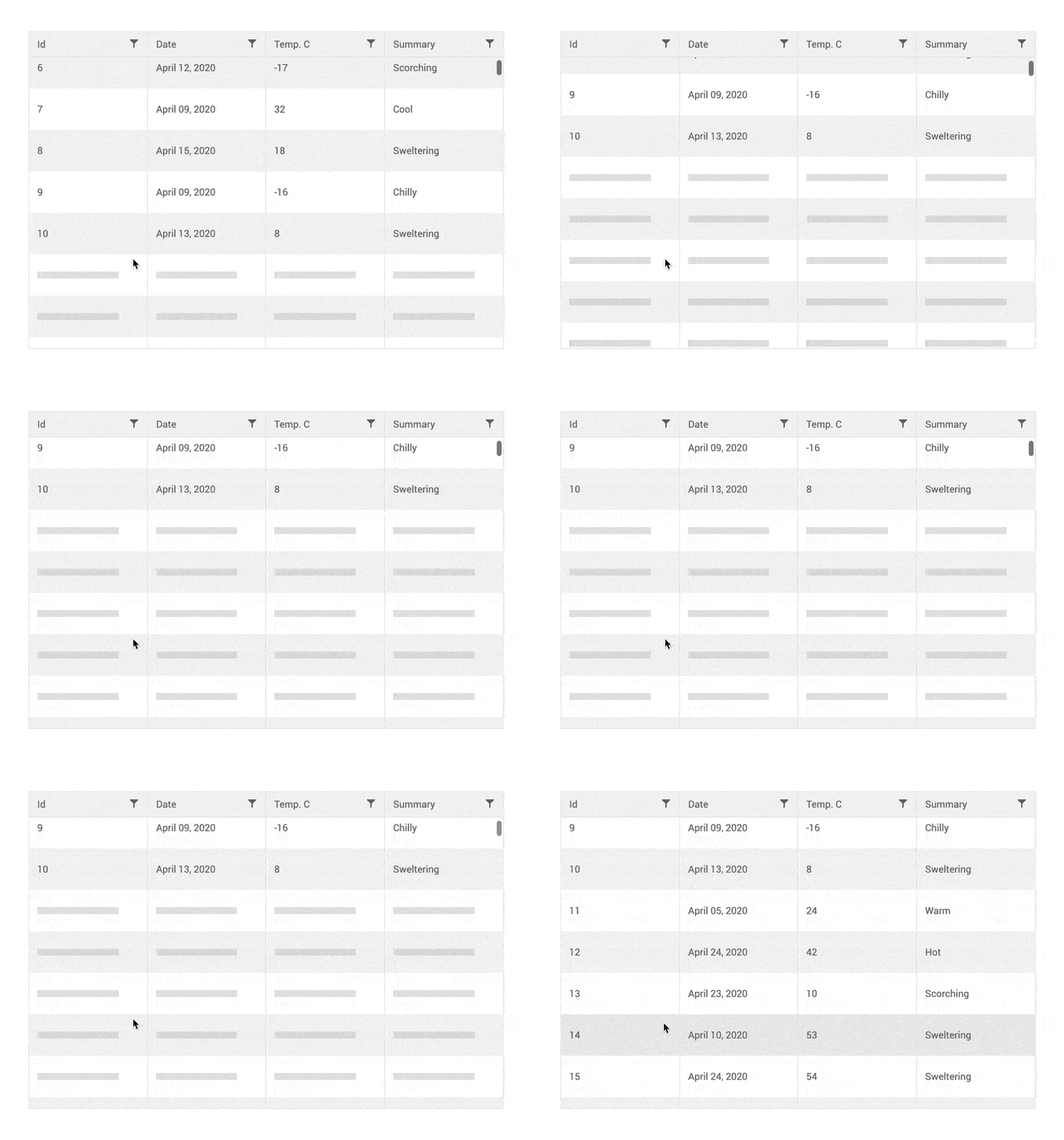
Enhancing the usability and performance of our data grid, we are introducing sticky columns and virtual scrolling. Sticky columns allow specific columns to remain visible while users scroll horizontally through the grid, fixing their position to the left or right. This feature ensures critical data is always accessible, even when dealing with a large dataset on limited screen space. Imagine being able to keep important identifiers like names or IDs always in view, providing a seamless and efficient data browsing experience.

Additionally, we are introducing virtual scrolling to the Kendo UI for Angular data grid, enhancing performance and user experience when handling large datasets. This feature dynamically renders table rows based on the user's scroll position, loading only the visible rows to ensure smooth and efficient navigation. By optimising factors like page size, grid height, and scrolling speed, users can achieve superior performance even with extensive data. Virtual scrolling reduces the load on browser resources, making it ideal for large data operations.

Enhancements to Charts

Improvement

We are introducing several enhancements to our charting capabilities, designed to improve data visualization and accessibility. Users can now apply patterns in chart rendering, adding a new dimension of visual distinction to data points. In scenarios where no data is available, charts will display a 'No Data' label, ensuring clarity and user awareness.

Further enhancing accessibility, we are improving the Sankey diagram with keyboard navigation for nodes and links, as well as right-to-left support. These updates ensure our charts are not only visually appealing but also inclusive and accessible to all users, reinforcing our commitment to delivering comprehensive and user-friendly data visualization tools.

Support for Angular 19

New feature

We are committed to staying at the forefront of Angular development. With the upcoming release, Kendo UI for Angular will fully support Angular 19. This ensures that our components and libraries leverage the latest improvements and optimizations, providing developers with cutting-edge tools and features. By aligning with Angular 19, we guarantee compatibility, security, and performance enhancements, empowering developers to build modern and efficient web applications without compatibility concerns.

Deprecation of Оld Angular Versions

Improvement

As some of the older Angular versions have reached End of Life (EOL), we plan to discontinue support for them in Kendo UI for Angular, too. We started in May 2024 with Angular 13 and 14. In November 2024, we will discontinue support for Angular 15 as well.

Telerik and Kendo UI Design Kits for Figma Upgrade!

Improvement

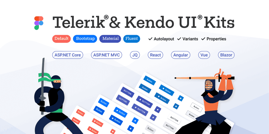
A significant overhaul to our Figma UI Kits is on the way! Central to these updates is the introduction of a rich variables library, seamlessly integrated with our design system. This library includes dynamic color, spacing, and radii variables, ensuring consistency and flexibility across your designs. Additionally, we're enhancing our Typography and Elevation systems to provide even more design possibilities. Dark mode enthusiasts will rejoice as we introduce Dark mode options, complemented by common theme color swatches. Our file structure has been revamped for improved organization, making it easier than ever to find what you need. Stay tuned for the addition of new components, including updates aligned with MS Fluent 2. Detailed component descriptions and improved color contrast are planned later in the year. Get ready for a smoother, more efficient design workflow with our upcoming Kendo and Telerik UI kits for Figma upgrade!

No items found.